Due to various technical reasons I have chosen to my move personal homepage, you can find the new version at vedransekara.github.io. There you can read my newest blog-posts and also find the old stuff as well.

Due to various technical reasons I have chosen to my move personal homepage, you can find the new version at vedransekara.github.io. There you can read my newest blog-posts and also find the old stuff as well.
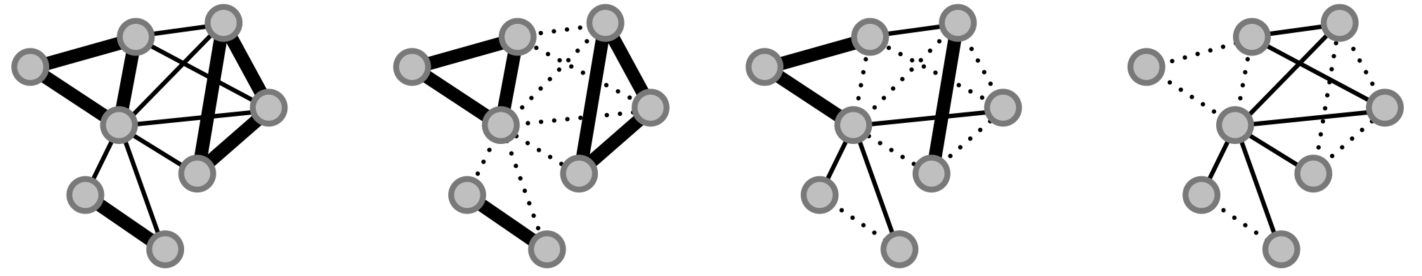
While finalizing my PhD I was asked, alongside Sune Lehmann, to author a popular article about networks by the magazine Kvant (danish journal for physics and astronomy). We wrote and submitted the piece and were fairly confident in our work. Nonetheless we were surprised when we were contacted by the editor who asked us for permission to use one of my figures for the cover page! This is my first cover page, and I gotta say, it feels awesome, next stop …. Nature 🙂
The figure shows telephone communication patterns between approx 300 randomly chosen individuals from the Copenhagen Networks Study over the course of two weeks.

Have you ever wondered which areas of New York City are the most popular? You need not worry anymore, this little movie will answer your questions. The video shows the dynamics of pick-ups and drop-offs within a representative week. It is interesting to see how the popularity of areas changes over the course of a day, and how certain areas attract more attention during nighttime. To me the circadian patterns resembles a heartbeat.
I’m doing this for fun, but as it turns out this amazing data-set has attracted the interest of multiple research groups. A particularly interesting study, that investigated the benefits of ride-sharing, was recently published in PNAS by Michael Szell and collaborators (link). The authors demonstrate methods that reduce service cost, emissions, and the cumulative trip length by 40%.
Another project, Hubcab, has produced stunning visualizations of the data (check it out here). It further lets you explore the data for yourself. Giving interested individuals without a data science background an opportunity to study how millions of New Yorkers take and share cabs.
One of the most iconic sights in New York are its Yellow cabs. They are ubiquitous and an important lifeline that tie the city and its inhabitants together. Understanding how cabs move around can give us new insights into how people travel within the city, how people use the city, and which neighborhoods are popular.
Recently this data was only something data scientist could dream of, that is until Chris Wong through a FOIL request (Freedom Of Information Law) got access to it! You can read more about the legal process he had to go through here.
The data is actually quite amazing, around 20 GB in size it contains detailed logs of roughly 173 million taxi trips during 2013. This cover fields such as: Taxi_id, pickup and dropoff locations, trip duration, fare price, tip amount, etc. There have unfortunately been some problems regarding the anonymization and privacy of the data. Nonetheless this data is a veritable gold mine for visualization specialists, data scientists and network scientists. So I decided to look into it.
First and foremost I had to download the data, however, downloading a 20 GB file can be a hassle. But don’t worry Andrés Monroy has decided to divide the data into smaller chunks and is currently hosting the files on a simple download page.
When you are dealing with 173 million data points there are always bound to be some outliers or corrupt entries. So a good idea is to plot some basic statistics first, such as distributions of duration, distance, and the geographical coordinates of trips. Plotting them I made some peculiar observations, such as trips lasting more than 48 hours or taxis suddenly ending up in the middle of the ocean. Disregarding these outliers we can begin to look at more interesting stuff.
First I collapse all data into one week and investigate if there are any differences between months in terms of raw number of trips (of course bearing in mind that each month can have different number of weeks and days so normalization has to be performed properly).
 The plot shows the average number of trips per hour during a week. In weekdays activity is low during nights, but picks up after 8 am when the city start to wake up. At 5-6 pm there is a slight drop followed by an increase later in evening where people are going out to social events. Consequently this is later followed by a decrease during nighttime where people return to their homes. Interestingly we can observe that people stay out later as the week progresses. Sunday is a day of rest.
As we have the number of passengers per ride we can also investigate the flow of people within the taxi network. More specifically we can look into when people are more likely to share cabs. Again we divide data into months and collapse trips within each month into a weekly schedule. This should smooth away any fluctuations. We observe that more people share cabs during the weekends than during regular weekdays. Interestingly we also observe a special behavior during Tuesday morning for January and Tuesday night in December. As it turns out these days mark New Year celebrations. The jump on Monday night / Tuesday morning marks the flow of people going home after the 2012-2013 celebration, while the peak during Tuesday night marks movement of people traveling to their respective parties for the 2013-2014 celebration.
With this much data we can also look into locations from where it is easiest to catch a cab. Plotting 173 million data-points, however, is not informative, a better idea is to bin them. The figures below show 2D hexagonal histograms for the pickup locations of taxi trips divided into afternoons (2pm-9pm) and nights-rides (9pm-3am) respectively. Independent of the time of day there always seems to an abundance of cabs in Midtown. During nighttime some differences arise, and more people are picked up in the West Village, Little Italy and Nolita — clearly indicating party districts.


This is a work in progress, and there is more to come!
Is just around the corner!
We have some cool results that hopefully should be published soon. Until then here are two teaser pics.
1) Focusing on individual node participation levels we look at community detection from a new angle. Inspired by the visualizations of Axelsen et al. we can plot social gathering according to how much time each person participates in a group and get these stunning contour networks.
 2) Nested histograms! Unable to decide whether we should plot data in daily or 8-hour bins, we choose to to both—producing these cool histogram structures. They allow some arbitrary quantity X to be plotted with respect to multiple temporal resolutions.
Since I as a kid watched my first world cup (1994), I have been hooked on football (or soccer as the Americans call it). Back then l I remember that almost every player used to wear Adidas Copa Mundials – a stylish, yet simple black leather boots with 3 white stripes.
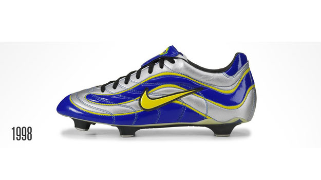
However, everything changed at the 1998 word cup, when Nike equipped Ronaldo (no, not Christiano Ronaldo, I’m referring to the original one) with Mercurial Vapor, silver and navy colored boots with a golden swoosh symbol. Since then, brands like Adidas, Nike, Puma, and others have fought for public attention by equipping players with increasingly more colorful boots. Culminating in Puma releasing their 2014 evospeed boots, with the two shoes having different colors!
Now, since I am both a football fan and an aspiring data-scientist I wanted to do some statistics regarding brands at the world cup, with a special focus on football boots! But first lets start with the jerseys. Each brand tries to promotes itself by sponsoring countries with individually designed jerseys, where the Ghana (home) and the US (away) jerseys are some of the coolest this year (according to me). Below I have plotted the brand statistics, i.e. how many national teams each brand supports

As suspected the big 3: Adidas, Nike, and Puma support a majority of the teams. But since players are free to choose their own boots, or rather the brand of their boots, will this look different for boots? This question is very hard to answer, since I need to know what kind of boots each player wears, and with 16 teams x 23 players each this results in 368 pairs of feet. Thus I instead focus on the question: which boots to goals scorers wear? And thanks to ESPN this question is much easier to answer since they have replays of all goals scores at the world cup (Yes I literally watched all goals in super slow motion and noted down the brand of boots). The figure below shows how many goals were scored during the group stage with each type of brand. Nike is leading with more than 18 goals! Bear in mind that I did not correct for no of players equipped with Nike boots.
 But we can dig deeper, since I also labeled all goals, i.e. whether they were regular goals, headers, free-kicks/penalties or own goals. Thus, below we see the distribution of goals scored during the group stage.
 So which boots score which goals? Well, investigating further shows that Nike boots dominate regular and header goals, while Adidas boots score more on penalties/free-kicks. Further, it seems that Nike boots are preferred by players who score own-goals.
 Stay tuned for more world cup statistics.
Ok, I know that I’m a bit late in posting this, but results form one of my papers [link] was featured in Forbes Magazine.
The article is about data collection campaigns (hint: NSA), but also mentions our SensibleDTU project. Basically how I see it, the issue is not about whether data collection is good or bad, but how we as researchers/organizations/countries decide to use this data.

Things are moving fast now.
We just uploaded another paper to ArXiv. Check it out!
Measuring large-scale social networks with high resolution

Just submitted a paper – Wohoo!
Meanwhile until it is published you can find it on arXiv.
The paper investigates usability of the Bluetooth sensor is as a proxy for real life face-to-face interactions.
You can learn more about the data on the SensibleDTU homepage.
I will be giving a talk at the Niels Bohr Institute on December 4th. Topic will be “Social Contacts and Commnities”. It is based on the results and finding from the SensibleDTU project.
More info here!
